Redesigning your Club Website? Why Images Matter
Websites have evolved far beyond basic information hubs. They’re now platforms for storytelling—able to engage, inspire, and foster connections. For...
3 min read
 Maggie Heil
:
November 20, 2024
Did you know it takes only 0.05 seconds for someone to form an opinion about your website? That means everything—fonts, colors, images—plays a role in that first impression. Your club’s website is a window into its story; how you tell it matters. With visitors often sparing just 6 seconds to glance over your website’s content, making a strong visual impact is more essential than ever.
Many clubs looking to redesign their websites believe that reusing written content on a new template will be enough. While the images and graphics should authentically reflect your unique club, a proper website redesign also requires reviewing and refining every aspect of the content to ensure it delivers a cohesive, compelling narrative. By thoughtfully balancing your website's visual and written elements, you can create an online experience that resonates deeply with your members and prospective members alike.
Many clubs still treat their websites like digital brochures. There’s a mix of amenity photos and basic details – sometimes only including a running laundry list of offerings. But your website needs to step it up in today's digital world. It can be your biggest superpower when it comes to attracting new members.
Most club leaders boast about their culture when asked what makes their club special. Each club is different, and your website helps demonstrate that. By featuring compelling visuals and stories, you can invite visitors to experience the heart of your club before they even set foot on the grounds.
Browse through most club websites, and you'll often see a pattern: beautiful but empty dining rooms, pristine but people-free golf courses, and spotless fitness centers without anyone using them. While these spaces look impressive, they miss what makes a club special: its people.
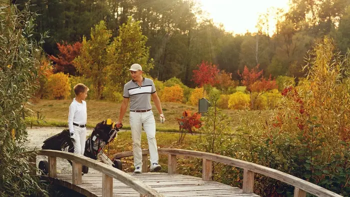
Improve your club’s website by bringing your spaces to life. Showcase your club’s stunning spaces with photos of real people using them. Consider the difference between a static picture of your pool compared to a picture of a happy family playing in the water. It can make a huge difference to a potential new member exploring your club’s offerings.
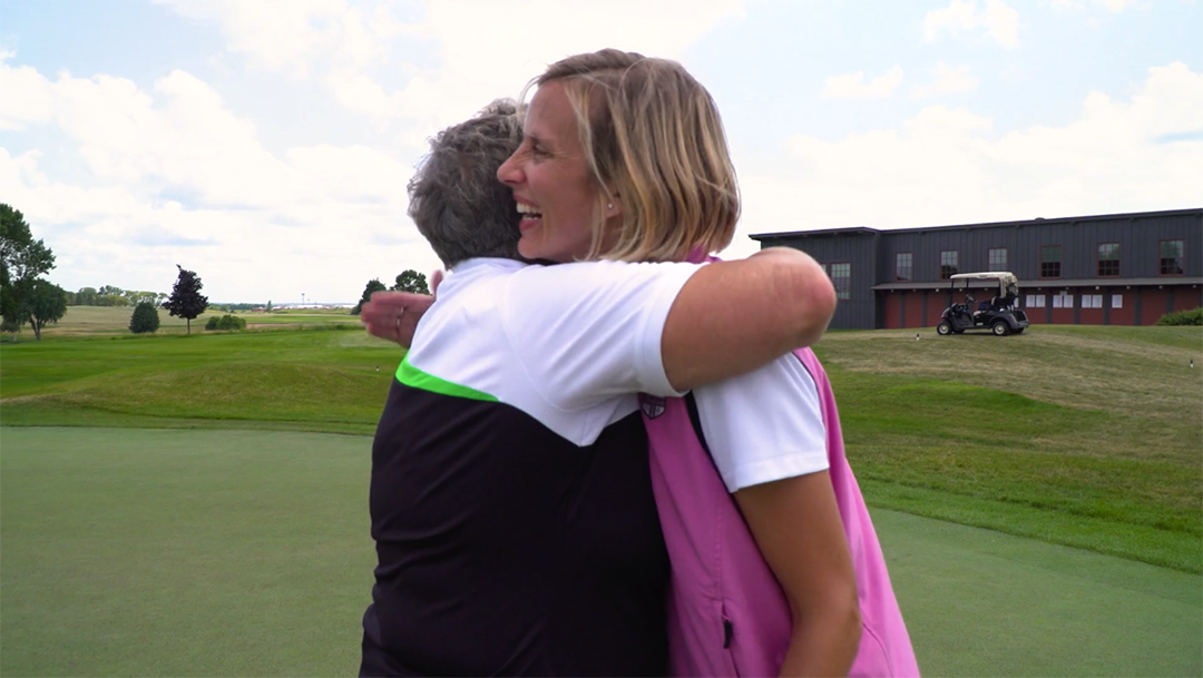
Your club’s real charm isn’t just in the championship golf course or the upscale facilities. It’s in the connections—members who greet each other by name, weekly bridge games that go back decades, kids bonding over junior golf clinics, and members celebrating life’s big moments together. And then there are those laid-back conversations by the pool or at the 19th hole. Your website can capture these authentic, everyday moments that make your club feel like a true community.
When prospective members visit your website, they’re not just scanning for amenities. They’re picturing themselves there, imagining what it might feel like to be part of your community. They’re envisioning their families eating in your dining rooms. They’re imagining their kids hanging out with friends by the pool. By showing real members enjoying club life, you invite visitors to see themselves in those moments—attending events, building relationships, and creating lasting memories.
According to Forbes, adding videos to your website can increase the time a user spends on your site by 88%. Add videos that bring your club’s culture to life even more. Include clips of members sharing what they love about the club, friendly staff helping out, or unique events in action to give a more vivid, authentic glimpse into club life. See how we added simple moving videos to our home page to elevate the user experience.
While you can easily include videos in the broad strokes of your website design, you can also get specific in showcasing real stories. Check out the following video:
Your staff is often the heart and soul of your club’s member experience. Spotlight their dedication by featuring images of them in action—greeting members, setting up events, and going the extra mile to make members feel at home. These behind-the-scenes moments bring to life the warmth and attention to detail that define your club. See how Sugar Mill Country Club accomplishes this on its "Meet the Team" page.
Your website is often a prospective member’s first encounter with your club, so make it count by moving beyond a “digital brochure” approach. Use engaging visuals and real-life moments to show visitors that your club is a place where they can feel at home. By focusing on the human element, your website can create an inviting digital experience that captures what truly makes your club special: the people. Amenities might attract interest, but it’s the sense of belonging that turns visitors into lifelong members. For more tips on digital marketing for private clubs, click here.

Websites have evolved far beyond basic information hubs. They’re now platforms for storytelling—able to engage, inspire, and foster connections. For...

For years, private clubs took pride in their air of mystery. Many didn't even bother with websites, and those that did often stuck to bare-bones...

This blog was updated for accuracy and relevance on March 6, 2025.