5 min read
12 Rules for Stellar Homepage Content That Converts
![]() StoryTeller Team
:
Updated on June 7, 2024
StoryTeller Team
:
Updated on June 7, 2024
Your homepage is one of the most important parts of your website – just as a retailer's window display should draw shoppers in, you want to make sure that your homepage contains content that converts. Where a landing page focuses on a very particular audience for a very particular purpose, a homepage needs to appeal to visitors in all stages of the funnel (and, depending on your product or service, multiple personas as well). This, as I'm guessing you know, takes strategy and effort.
Whether you're redesigning your website or just looking to freshen-up your existing homepage, you should always keep conversion in mind. Here are twelve rules to keep in mind to make sure your homepage content converts:
1. Make sure you have a clear objective for the visitor in mind.
What do you want your visitors to do? The goal of your website should be to compel visitors to dig deeper and move further down the funnel – what does that look like for your company? Let's look at Wistia as an example. When you arrive at their homepage, here's what you see: Simple and effective. As a visitor to this page, you know exactly what you're supposed to do – click "Learn More." The design is understated and there is nothing to distract the visitor from digging into the website. This is the most important rule – if the visitor doesn't know what to do after landing on your homepage, there is a pretty big chance that they will bounce right over to the next listing on their Google search.
2. Tell your visitors what you do.
This may seem obvious, but you might be surprised at how many websites make this difficult to discern. The user should not need to click "About Us" or "Our Capabilities" to know what your company does. In fact, you want to make sure that you tell them what you do within three seconds of their arrival on your homepage. Again, Wistia does a fantastic job with this. The headline, "The video marketing platform for business" clearly communicates their capabilities, and quickly screens visitors to make sure they are a good fit for Wistia. Looking for somewhere to post your cat videos? You probably won't be on Wistia's website for long.
3. Or, explain what problems you solve.
Unbounce is a great tool for marketers without a ton of IT experience or access – and, when those marketers arrive on the Unbounce homepage, they know it right away. This also qualifies their visitors right away, which leads to less of a headache later on.
 4. Don't forget your logo and site navigation.
You want your site navigation to be easy-to-use and to display all of the elements of your website. If the "Contact Us" selection is buried in a dropdown or two, you're going to miss easy conversions. Also, a friendly reminder – make sure your logo is up-to-date, and that all of your site navigation links work.
This may seem like a no-brainer, but I recently ran across this example: If you Google "Geek Squad" (or look at the Best Buy site), you'll see their new logo, but visit them directly, and you'll still see the old branding. Not only is this confusing, but it will make your visitors wonder if anything on your website is up-to-date – definitely not a good way to instill trust.


5. Make sure you resonate with your audience.
As with most inbound marketing strategy, you want to make sure that you resonate with your target audience. If you're targeting a very specific profile with a lot of technical knowledge, then you want to make sure you include those technical terms and phrases in your copy. However, do your best to avoid any corporate jargon – it doesn't mean much, and tends to annoy people.
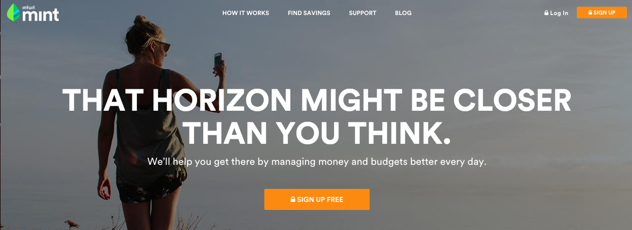
 Mint does a great job of resonating with their target audience. If you don't know, Mint is an app that connects to your bank account(s) and credit card(s) to help you track your spending and stick to your budget. The phrase "That horizon" is enticing but vague enough that the visitor can envision their own dream, and the "Sign Up Free" is conscientious of the fact that their market is likely money-conscious.
6. That being said, don't litter your homepage with keywords.
This may have been the good practice a few years ago, but it's no longer necessary for search purposes and comes across as suspicious.

Code Academy is a great example – they are the first Google result for the keyword "learn to code," but they only have it once on their homepage. They chose the most relevant keyword they could, and optimized for that one keyword. And, it's working!
7. Incorporate great design.
Great visual design is just as important as relevant copy – without great design, your homepage won't communicate trust and competency to the visitor. You have a lot of different options when it comes to great design, but you want to make sure that you use color, font, white space, and layout to communicate your brand while effectively navigating your visitors to the next step. (This is much easier said than done, of course.)
8. Don't forget to incorporate responsive design, too.
Now that more Google searches come from mobile than desktop devices, responsive design is really, really important. Nobody likes navigating a desktop website on their smartphone, but responsive design is so commonplace now, that it's less an asset and more an expectation. Don't have responsive design? You're behind the times, and that takes away trust points. Still need convincing? Google now factors responsive design into mobile ranking results.
9. Speaking of design, don't worry about the fold.
It used to be really important to keep every element of your homepage above the fold, but thanks to mobile, everyone is getting used to scrolling again. Sure, you want to keep the most important pieces above the fold, but feel free to dive deeper beneath it. Spotify is a great example:
Above the fold:

But, if you're not quite sold, you might scroll down and find more information:
Below the fold:

Now, the visitor can read a bit more about the product and you have the chance to capture some of those visitors who may have bounced without more information.
10. Don't forget your CTAs.
Ultimately, you want to convert your visitors to customers, right? Right. The best way to do that is with some good CTAs. Now, as we earlier discussed, you still want to keep a clear objective for your homepage – so, choose a primary CTA, and make that front and center.
 Sprout Social does a great job of directing your eye to their primary CTA. It's bright, it's in the center, and the background image uses some strategic angling to subtly redirect the eye back to the middle of the page. Sprout Social wants their visitors to sign up for a free trial, and they've made that clear with their design. They do have another CTA in the corner (it doesn't have to be the same CTA), but by choosing muted colors and hiding it away, it is not distracting from the main focus. I think HubSpot put it best – "CTAs turn your homepage into a sales or lead generation engine, and not just brochure-wear."
11. Include social proof.
This one's a no-brainer – include social proof on your homepage. If you have big industry names or brands, be sure to include them (above the fold, if you can). Follower counts, fantastic reviews, anything goes – but make sure it's there. For Slack, a relatively new platform for project management, social proof takes the spotlight:

Not convinced? Just reload the page:

Side note – not only is Slack's social proof really convincing to the competency of the platform, they highlight it in a way where it also speaks to the human desire to be a part of something bigger. Changing the world? Robots on Mars? It's enticing and exciting, and if it's good enough for NASA, it's very likely good enough for you.
12. Include a short video!
This is the StoryTeller favorite (although we may be a little bit biased). Now, it doesn't actually have to be a short video – we'll call an image the bare minimum. Short videos and images are engaging, and short videos do a great job of explaining your company, providing social proof, explaining the problems you solve, and more. If you go the image route, be sure to avoid cheesy stock photos – instead, choose a picture or video that evokes emotion.
Remember, you don't need to use video in the traditional sense – there are a million different things you can do with it.
Subscribe to Our Blog!

Traffic vs. Conversion: Laser-Focused Marketing Tactics for Growth
Ultimately, we all need to drive more business — sales teams are always asking for more opportunities, and marketing needs to deliver. So, as a...

A Tour Of Home (Pages): The Best Private Golf Club Websites
Your club’s website should be the home and heart of your marketing efforts–the place to kindle all new and existing relationships. It can and should...

5 Powerful Hacks to Boost Landing Page Conversion
Your landing pages are the worker collecting tickets for the Ferris Wheel at the carnival. They can either calm fears and encourage people to take...
